Interrations to get to the ILS layout
If your are looking for valuable information about GA Kneeboard, you can stop reading. This is only a post to geek about the creation process. As you may have noticed in our previous post, we have a new display mode for the Radio tile that looks like this:
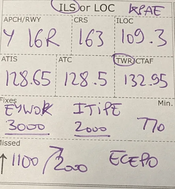
Now, this thing did not arrive fully form and it took few tests and iterations to get it where it is today. Here is the full journey.
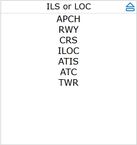
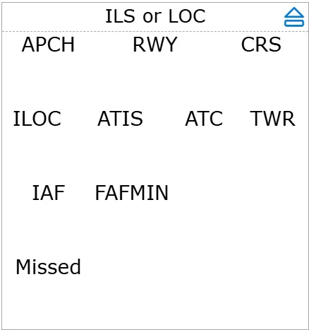
First, we are trying to figure out what labels belong
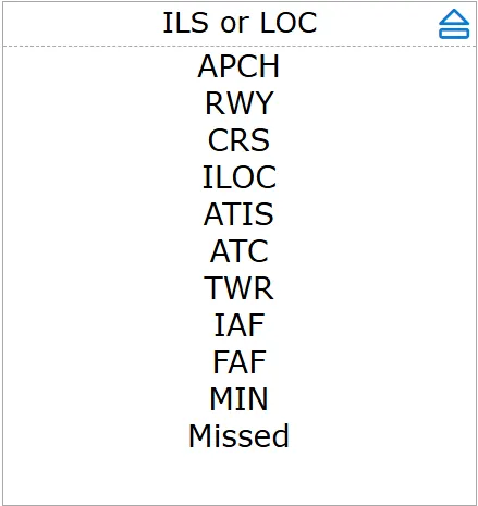
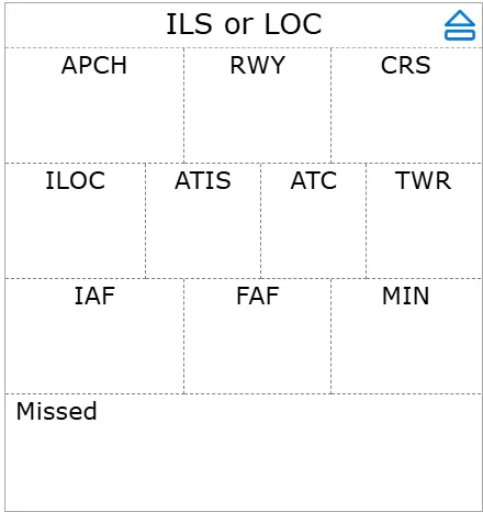
Once we think we have it right, we try to organize them in a logical grid
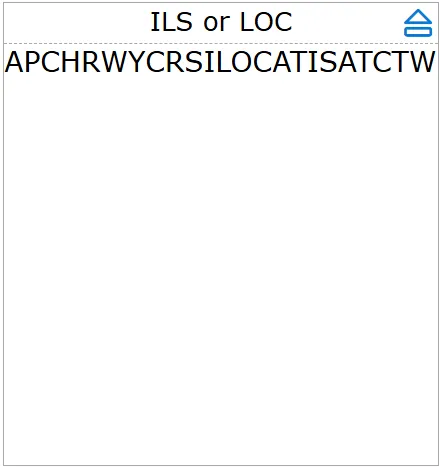
That’s ok but the font is still to big so we try smaller
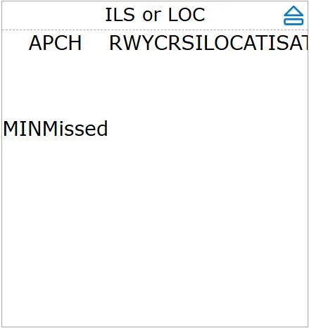
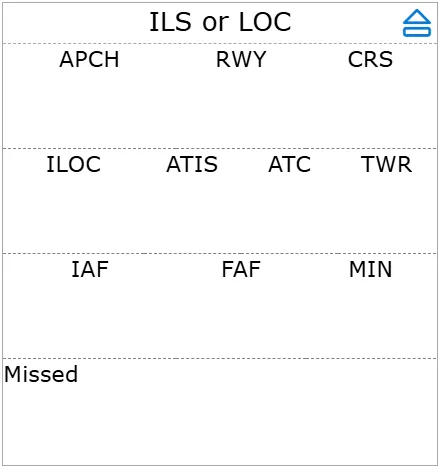
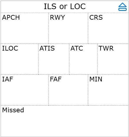
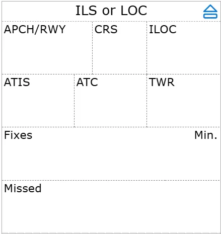
And we start adding some separators
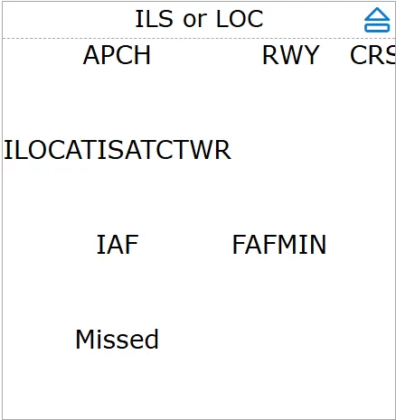
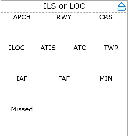
Aligning labels left give a more coherent look with the rest of the app
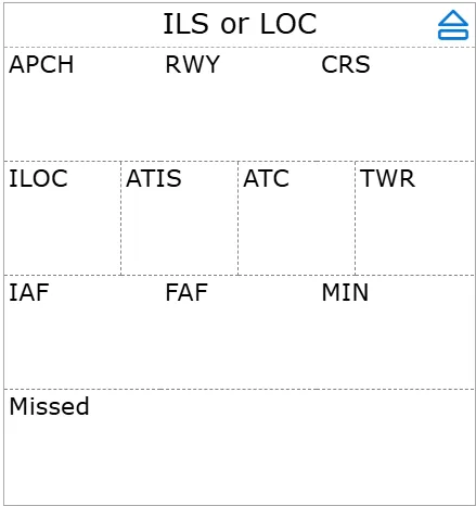
But upon testing some boxes are too small, so some vertical separators have to go
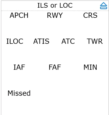
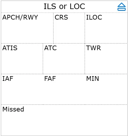
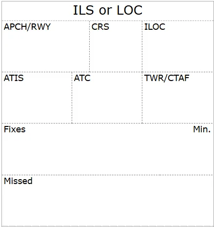
Or, we can group fields, such as APCH and RWY
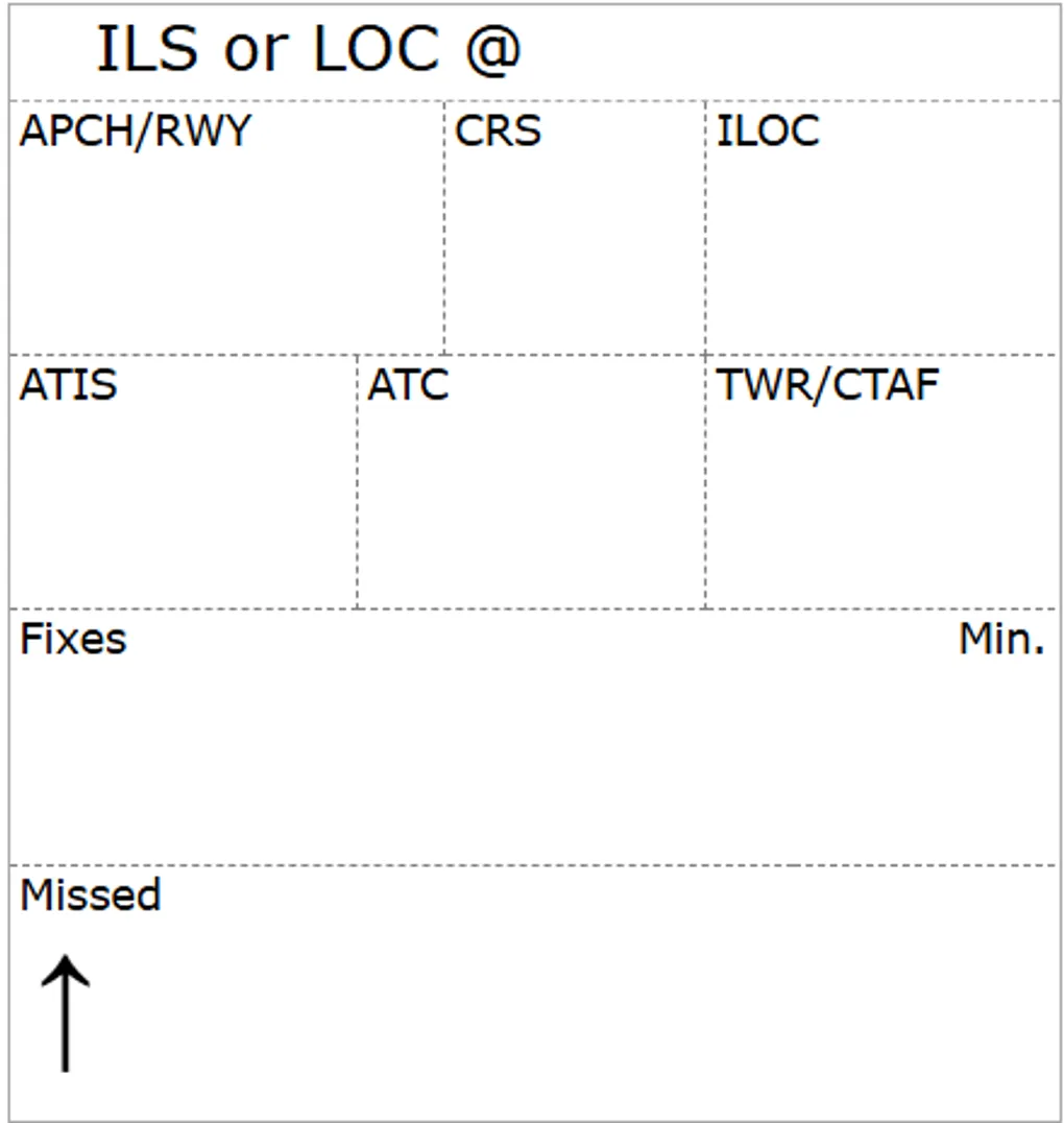
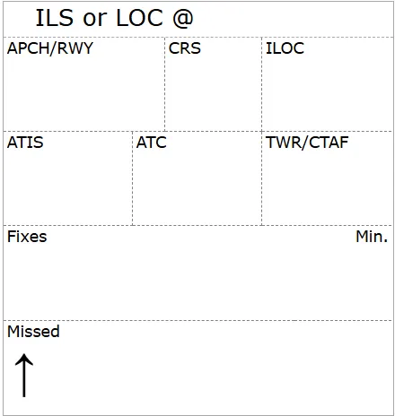
Now with those fixes, we can simplify with a generic “Fixies” and align Min to the right
The actual font used by other tiles is even smaller, let’s match
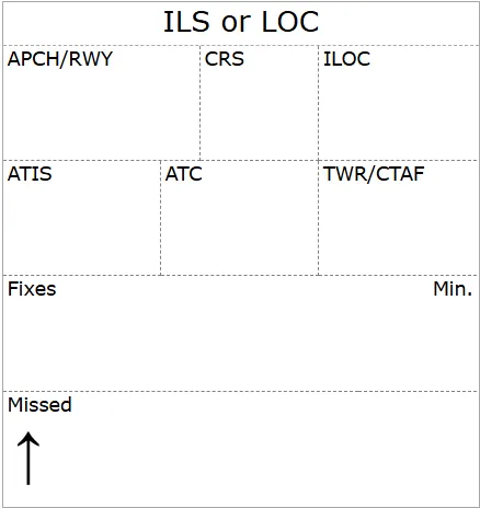
Upon testing, I find myself always writing the up arrow for missed climbs. We might as well provide a hard coded arrow.
Last thing, is I have several approaches, I want to write the Airport location, so offsetting the title will make room to write is down. And that’s the current version