Navlog creation process
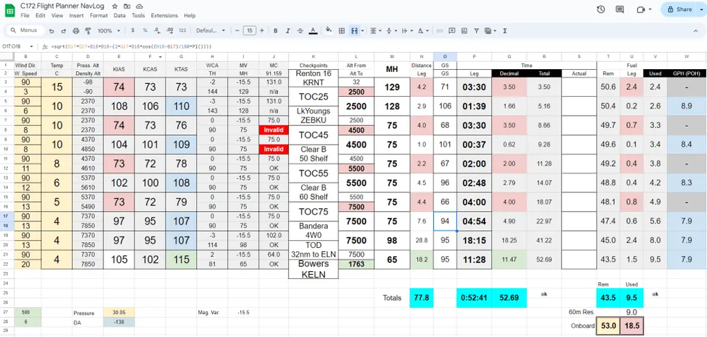
Like all PPL students, I had to digest the Navlog creation process with mixed results. The process felt inefficient, inaccurate and quite repetitive. At the same time, there is clear value in having the flight mapped in your head and it acts as a forcing function to figure out the expected weather along the way. After many iterations with various paper formats, I ended up with a useful Google spreadsheet that had most fields automated
I would basically print the right portion of this sheet and snap it to my … kneeboard! This was only a matter of time before some form of this sheet made its way to Kneeboard.ga, but it has been on my radar since day 1.
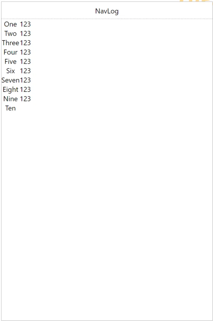
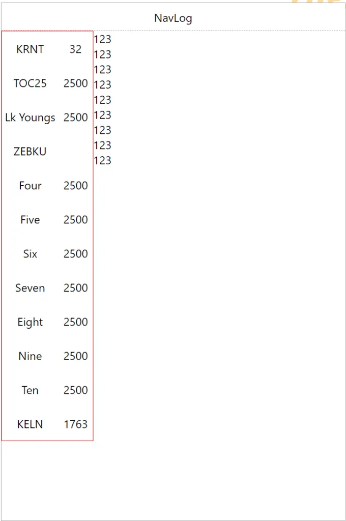
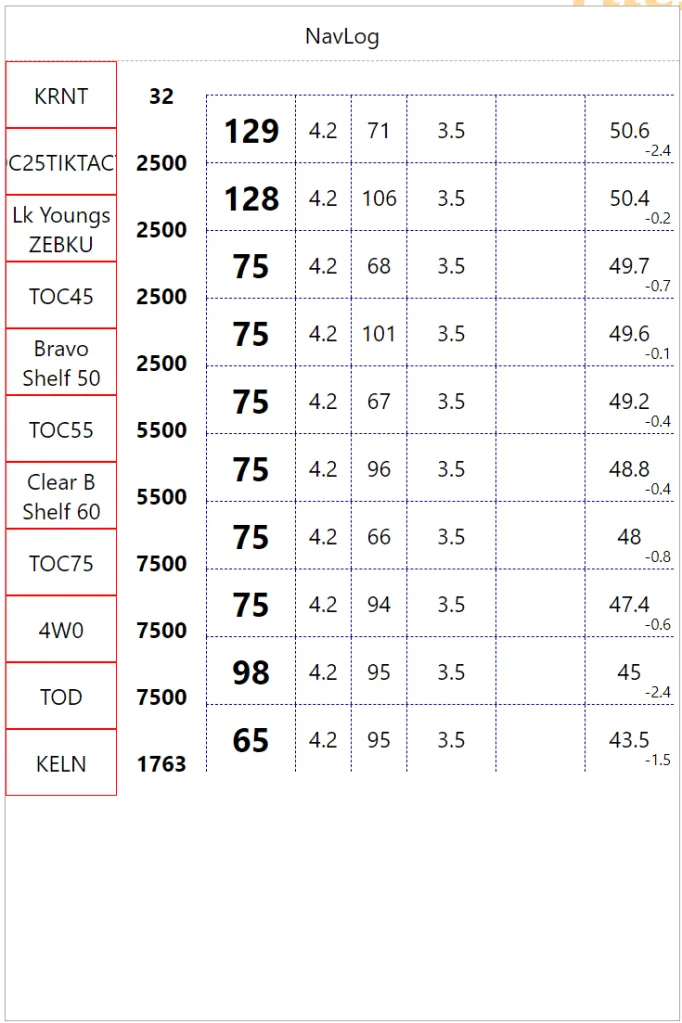
My first intention is to create a ‘dumb’ manual version of this sheet that would provide legible information when printed, leveraging colors and presentation trick. This post will walk through the iterations of the creation process. First step on the left is about figuring out how much space is needed to fit 10 rows. Then add vertical spacing. Notice the third column already has an offset.
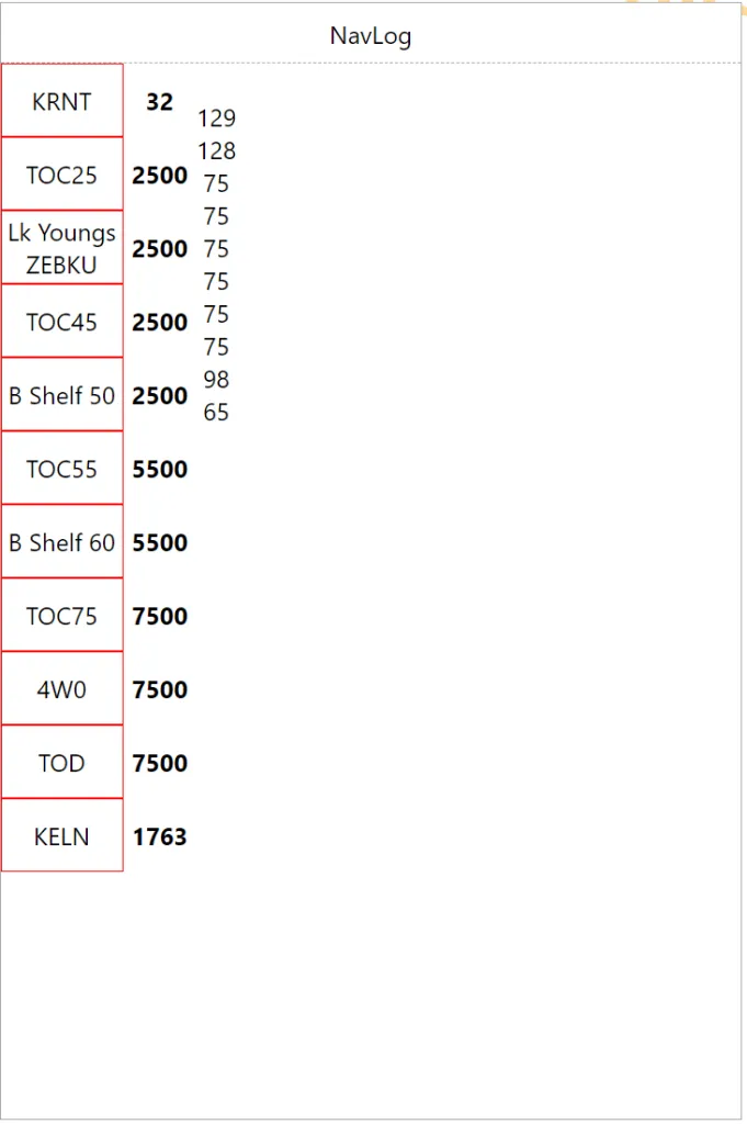
Now we are throwing actual checkpoint names to make sure the long one wrap correctly, then we boost the heading font size to something legible. We already have a good visual separation between checkpoints/altitude (left) and legs (right)
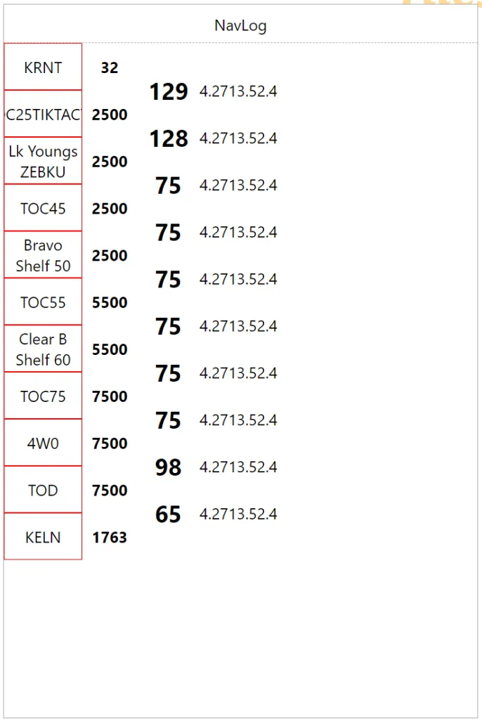
Next we allocate information along page width to get a sense of overall legibility. When you add separators, it makes event more sense.
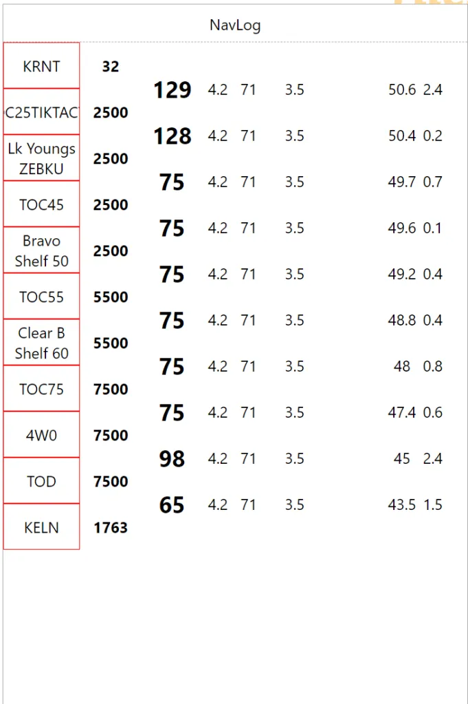
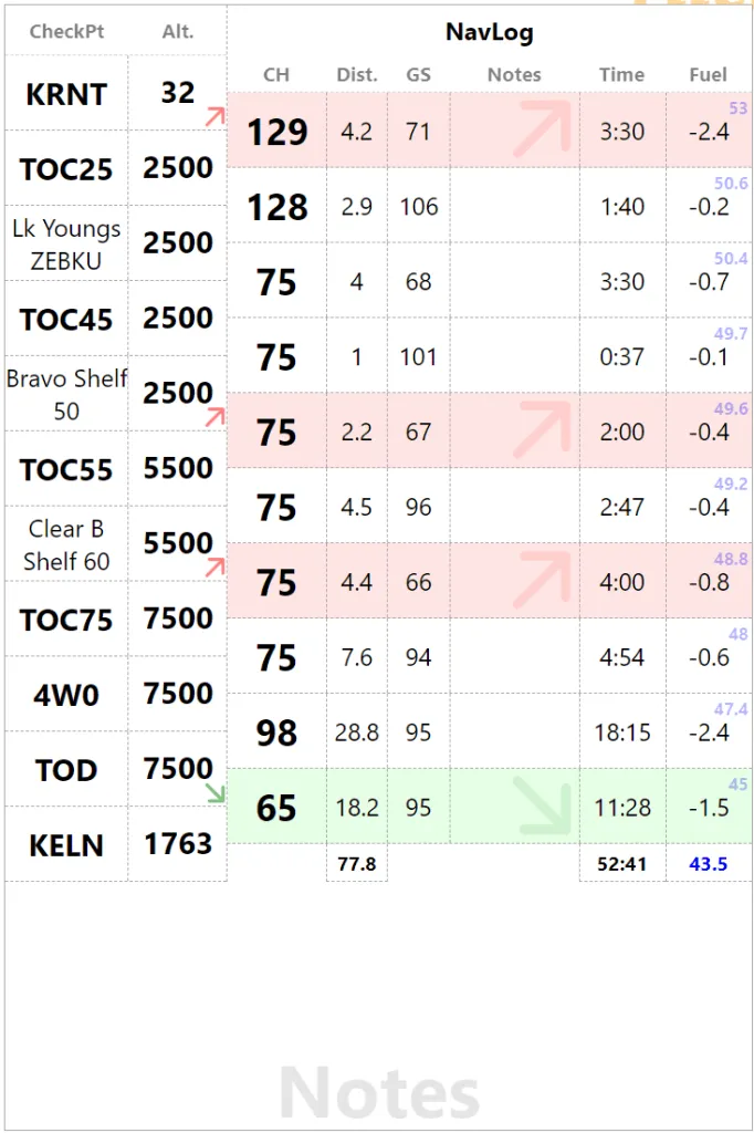
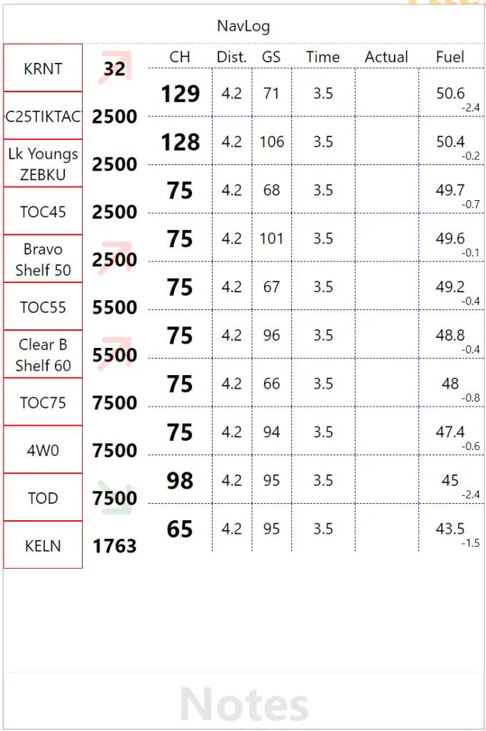
There are many data field one would want. For example, the last column will be used for fuel data which can be ‘Remaining Fuel’, ‘Leg Fuel’ or ‘Total Used Fuel’. Eventually these should be configurable since everybody has their own perfect format. We are experimenting with ‘Remaining Fuel’ as the main value and ‘Leg Fuel’ in the bottom right corner. I actually printed that version to check the small numbers were actually usable. Next we had column headers to disambiguate the data and a big ‘Notes’ watermark at the bottom to make the most of that space.
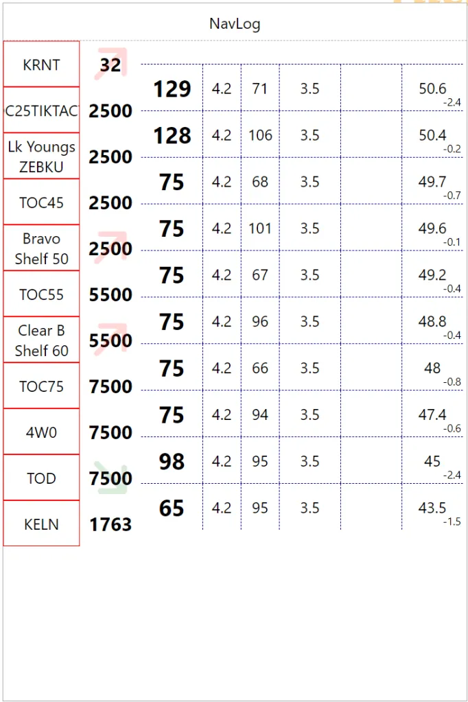
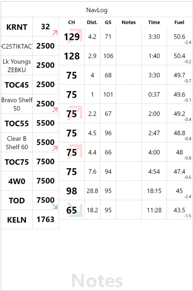
We are not enhancing the checkpoints, with a bolder font on short names and a big arrow to indicate changes in phases of flight in the altitude field. Red=Climb, Green=Descent. We are offsetting altitude value top of down to improve arrow visibility but it doesn’t look that good. So back to vertically centered with the text and now we have a big arrow in the heading and a small reminder in the altitude bottom right corner. We are also using more realistic values to distance to check the visual flow. In the process, the “Actual” column become “Notes” since I actually use it for fuel or time, we might as well make it generic.
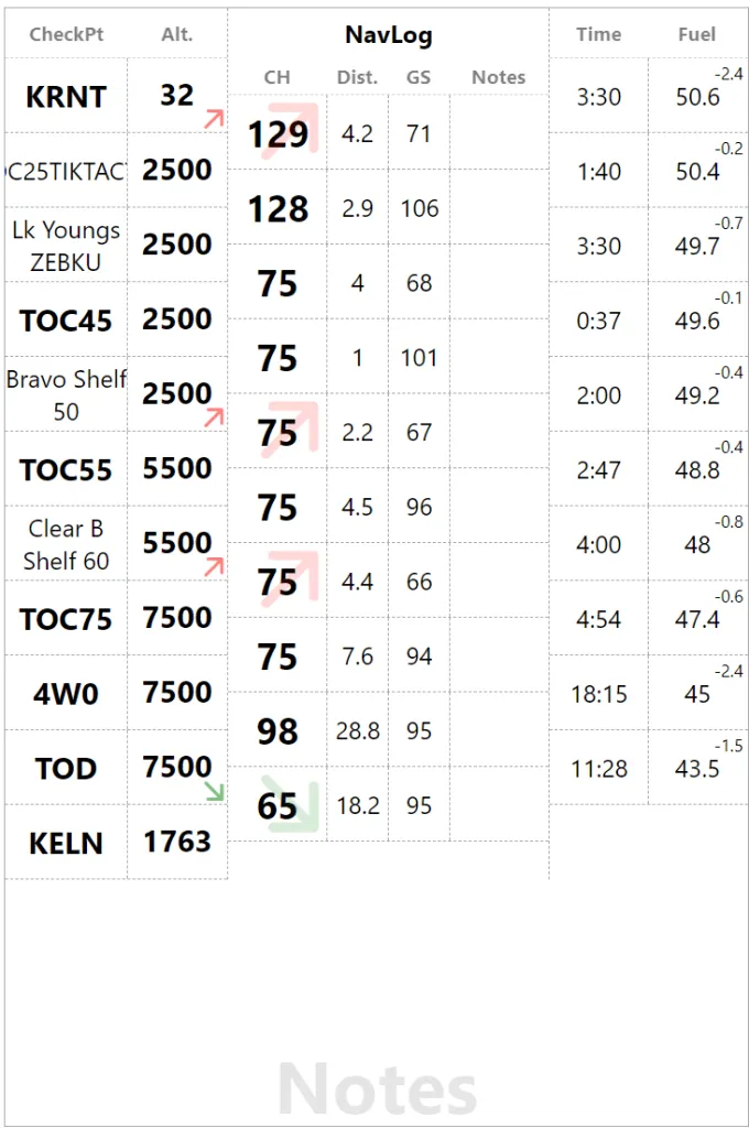
In this version, I am experimenting with last column offset. My thinking goes time and fuel are checked at checkpoints so they should be aligned. The result looks a little weird so I go back to my senses (on the right). In the process, I am not flipping Fuel Remaining and Leg Fuel. So the top right blue fuel value is full tank. We also have totals at the bottom for Distance, Time and Fuel (Remaining).
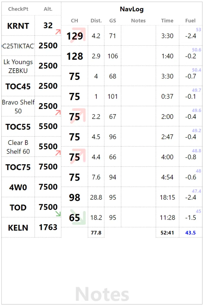
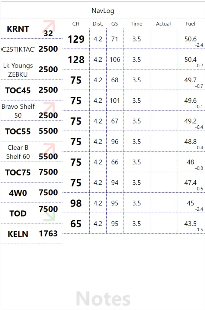
Final twist for the phase of flight hint, the whole leg now has a background color and the icon that was in the heading is now in the Notes column. This page needs more work, but that the original iteration. What do you think?